Wayfinding system Merano
An information and wayfinding system for the public realm of a town is a link between urban space, architecture and its appropriation by users – visitors and inhabitants. It is an expression of the place with its geographical, historical and cultural associations. A wayfinding system communicates the identity of a place and facilitates navigation between locations and spaces. Since 2013 Lupo Burtscher has been working on the new information and wayfinding system for pedestrians and cyclists in the town of Meran.


Lupo Burtscher defined and designed a comprehensive wayfinding system consisting of a typeface, a pictogram family, a color system, a design grid for the sign elements in different formats and specially engineered supports. Together with an interdisciplinary working group, Lupo Burtscher also defined the content, strategy and positioning of all elements in the public space.
A colour schema, a pictogram family, a typeface and a mapping system
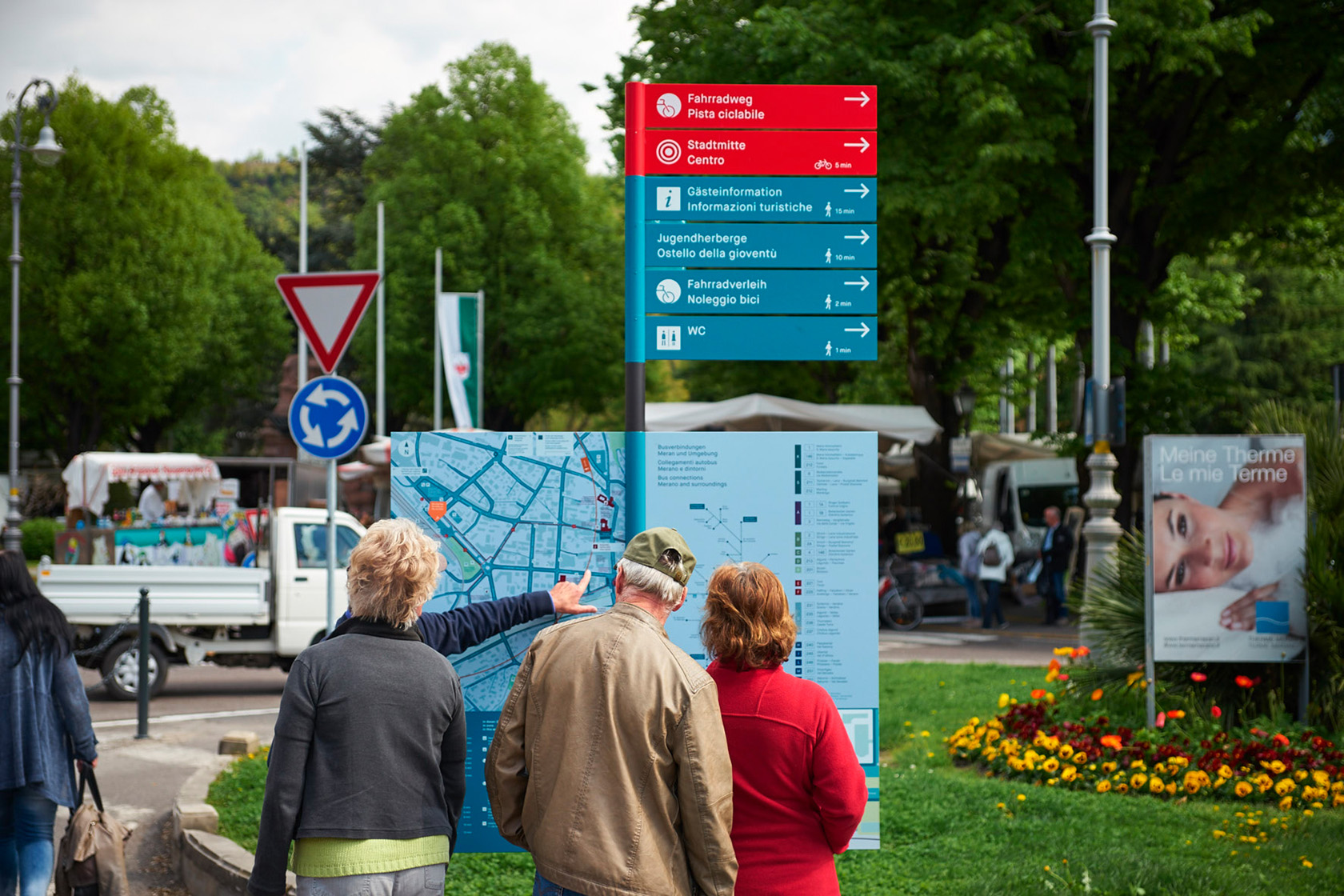
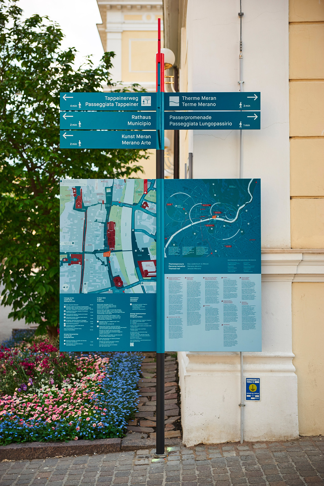
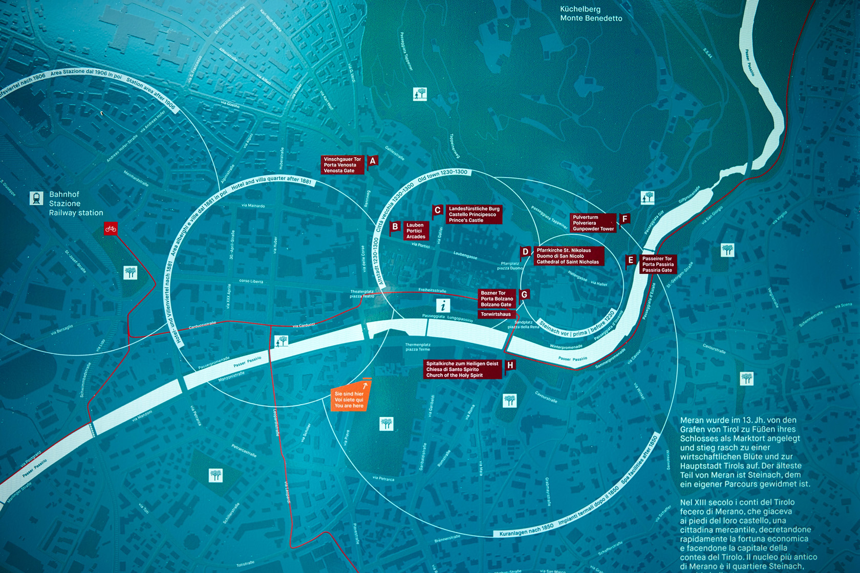
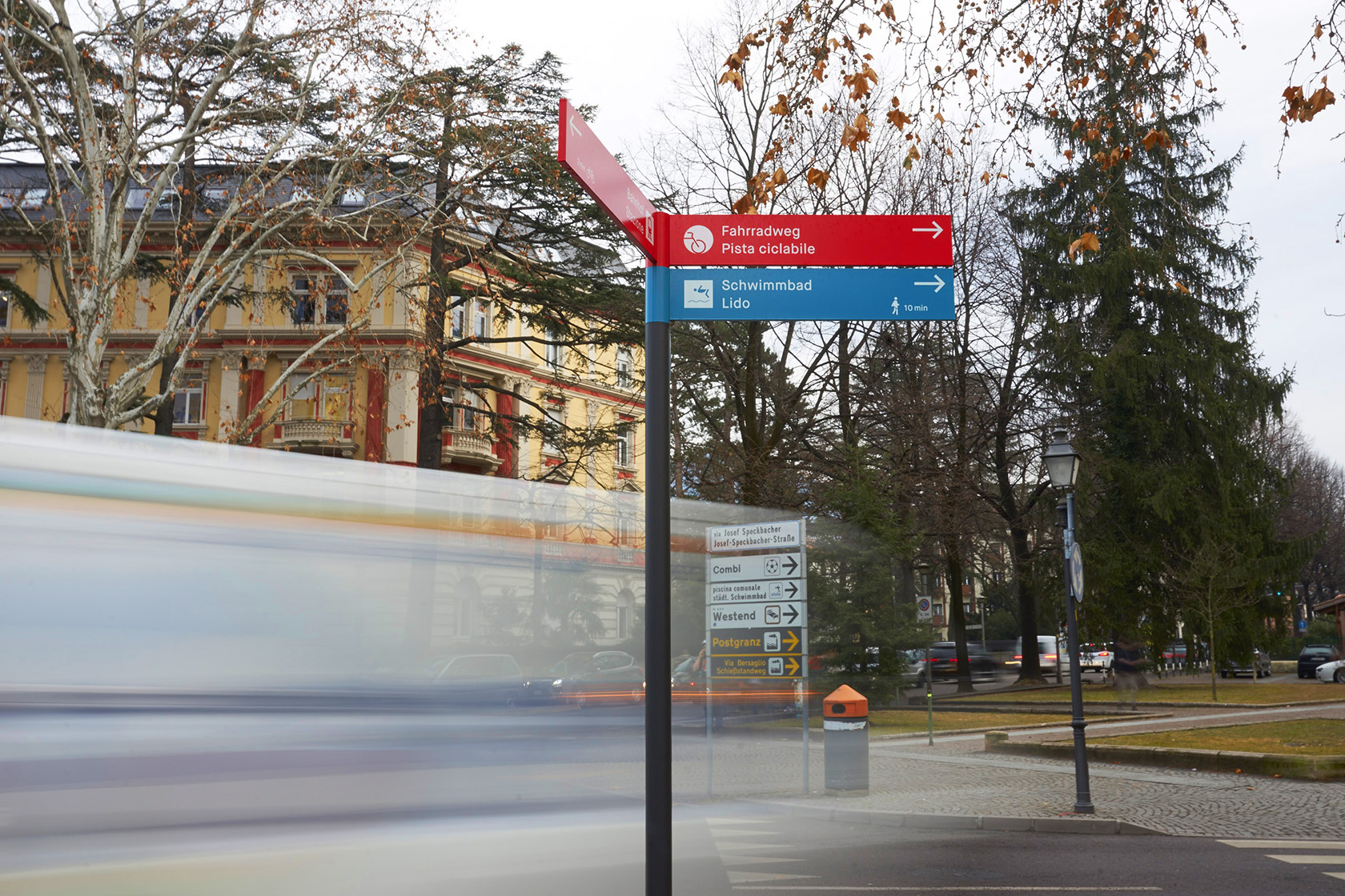
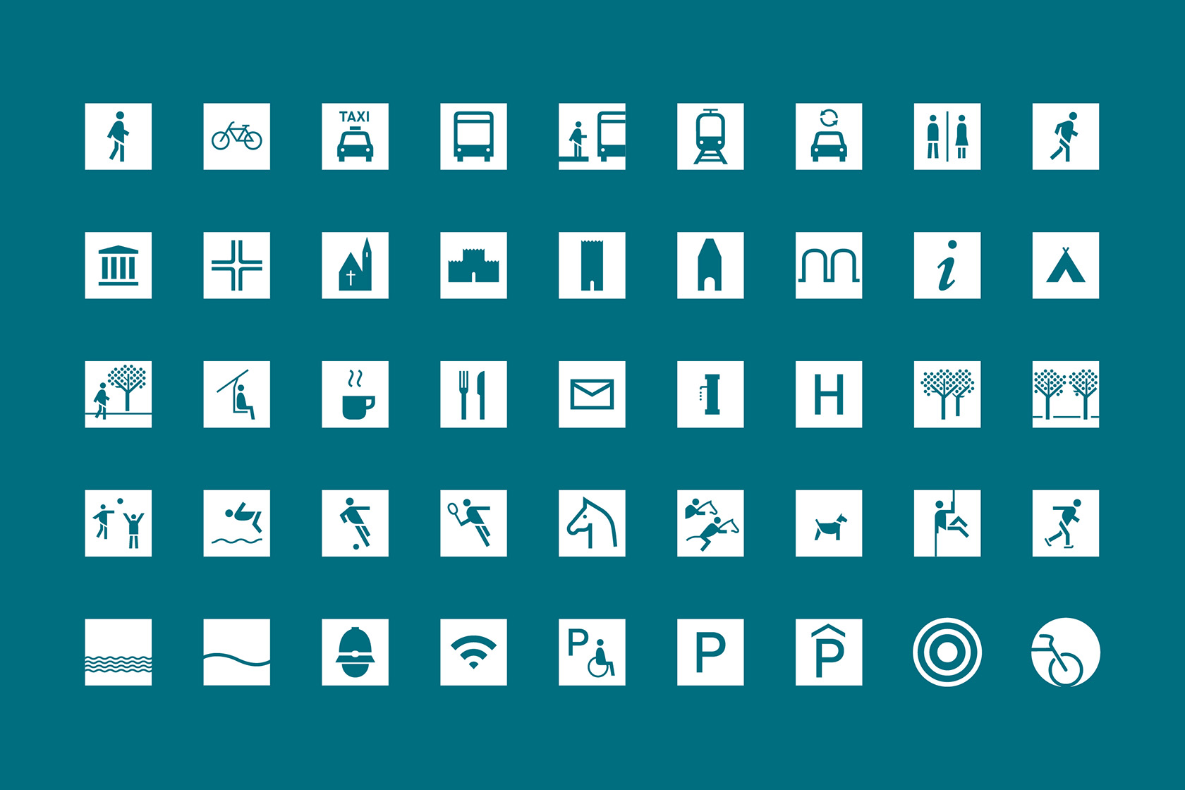
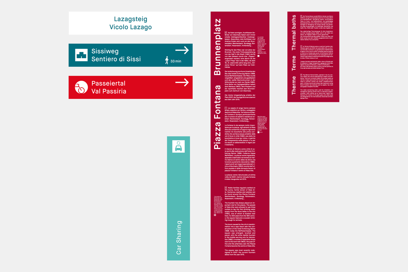
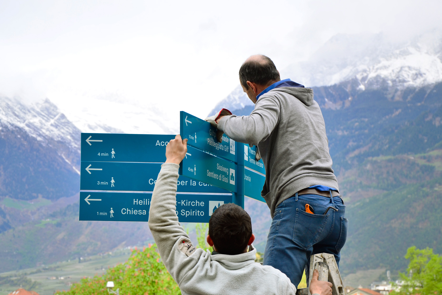
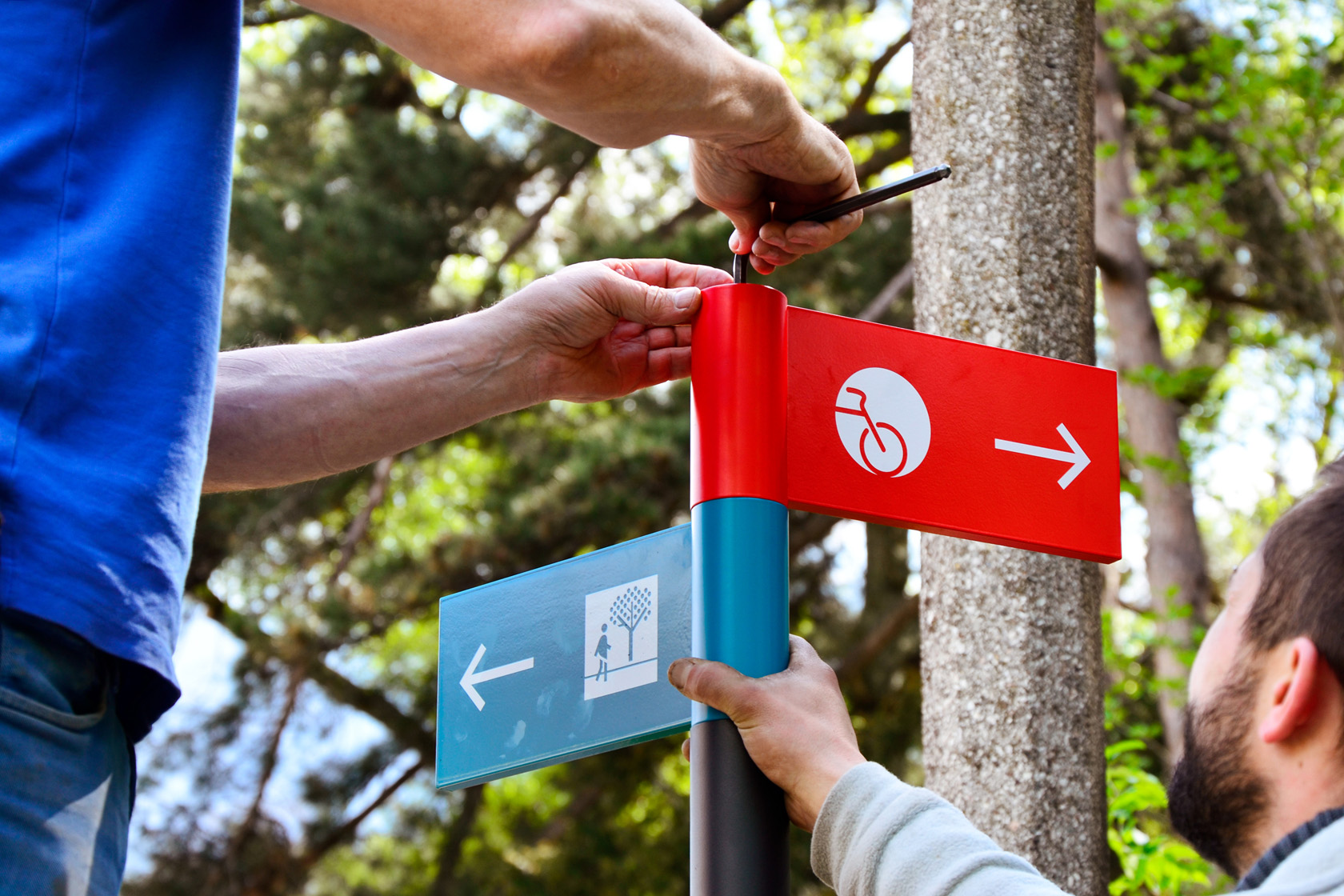
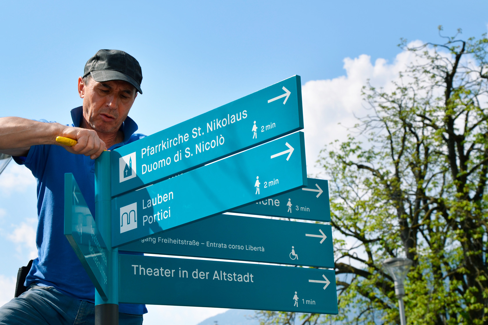
The visual identity by Lupo Burtscher consists of a colour scheme, a typeface, a pictogram family and a design template for the various sign element formats. The information and wayfinding system includes bilingual signposts in petrol for pedestrians and red for cyclists; descriptive signage in turquoise for services; a trilingual system of maps: close-up map of the city, thematic tours; the identification and trilingual description of places of interest.
The grotesk typeface Maison Neue lends the system a distinct character in various type sizes: macro-elements that are legible from considerable distances and micro-elements that convey information to users at close quarters. The Meran pictogram family builds on the lines and curves of this typeface.
A mobile system for the sign elements
The design studio defined the specially engineered supports and, together with an interdisciplinary working group, the content, strategy and positioning of all public realm elements.
The starting point of the supports is a round, dark-grey tube furnished with sign elements in diverse formats, creating a flexible modular system. The bilingual signposts in petrol and red work on three levels, communicating the place, the direction and the time required to get there. The large-format map is located at strategic places in the town and shows a close-up of the map of the town oriented towards the north. An overview map of the town shows seven thematic tours and describes all locations in three languages.